Data source: Twitter
Step 1: Connect your Twitter account to Netlytic
Note: Alternately, you can download the “Ebola” dataset that will be used for this tutorial from https://docs.google.com/spreadsheet/pub?key=0AilmXl-I6ZWkdHlsZElNWFZsNG9qM0pqZ3JhcGstaEE&single=true&gid=0&output=csv


Step 2: Go to https://twitter.com/search-advanced and create a test search query. For today’s tutorial, type “#ebola” into the “Any of these words” field and select “English” from the “Written in” drop down menu.

Note: Confirm that your search query returns some results; otherwise, go back and revise your search criteria.

Step 3: Once you are satisfied with the search results, go back to Netlytic, select the Twitter option under the “New Dataset” menu, copy & paste the search query from Step 2 (“#ebola lang:en”) into the second text box (Twitter Search Terms), give any name to this dataset (for example, “Ebola-today’s date” and click the “Import” button.

Note: If you downloaded the “Ebola” dataset from the link provided in Step 1, then use the “Text file” tab instead of “Twitter” to import your data into Netlytic.

The Import command will retrieve 1000 most recent tweets from Twitter that correspond to your search query. In our case, it is going to be any Twitter message that mentions the ”#ebola” hashtag and is written in English.
The next screen will confirm the number of messages that Twitter returned based on your chosen search query.

Step 4: Click “Next Step” to preview your dataset. This step is designed to confirm that your dataset was imported properly.

Note: Here you can select what fields to preview by clicking on the “Row Label Fields” drop down menu as shown below:

Step 5: Click “Next Step” and go to the “Text Analysis” menu, then click “Analyze” under “Keyword Extractor”. The extractor will then scan the dataset to find the most frequently used keywords and tally them up. (It will ignore all common stop-words such as ‘of’, ‘will’, ‘to’ found in the dataset.)

Note: Click on button that says “Remaining Posts” to see the completion progress of the automated text analysis. (You can check the progress status as many times as you wish.)

Step 6: Once the number of “unprocessed message” is zero, click on the “Words Cloud” button. A pop-up window will show a tag cloud of frequently used words.
NOTE: For more details on how to use this feature, see Section 3 in the online help page at https://netlytic.org/home/?page_id=20

Step 7. In the tag cloud, click the red color X-button to the right of the word “ebola” to remove it since it is a known common word for this dataset (it was part of our search query) and would be considered a noise word for the purpose of this analysis.
Note: The number next to the word shows how many times it is mentioned in the dataset. For example, although we only have 1000 messages in this dataset, there are 1046 mentions of “ebola” in our dataset. This means that some messages mention “ebola” more than once.

Step 8. Click on any of the remaining words in the word cloud (like the word “insufficient”) to examine the exact instance(s) where these words appeared in the dataset.
Hint: To get more context as to why a particular word was used so frequently, click and examine words that might be surprising or unfamiliar to you.

Step 9. Close the pop-up window and go back to the “Text Analysis” menu and go down to the “Categories” section and click the “Analyze” button.

Step 10: Once the analysis is complete, click the “Visualize” button under the Categories section to explore the resulting categories.

Note: The size of each area is proportional to the number of messages that correspond to each category.

Step 11: Click on any of the discovered categories, for example “feeling (good)” as it seems to be most unexpected for this dataset. The visualization will show the exact words that were found in the dataset and their relative frequency.

For instance, the word “great” is mentioned in the context of “a great discussion”.

Step 12: Close the pop-up window. Next, in order to create your own categories designed specifically to study information dissemination about Ebola, go back to the “3. Text Analysis” menu and click on the “Create/Edit Categories” button in the “Categories” section.
In the pop-up window (see below), disable the demo categories by clicking on the X button next to each demo category and create your own that you think might be relevant to this topic (e.g., policy, science, news, etc). Discuss what keywords/phrases you included in each category and why.
NOTE: For more details on how to create your own categories, see Section 3 in the online help page at https://netlytic.org/home/?page_id=20 and also read “Navigating an Imagined Middle-Earth”.

Step 13: Go to the “4. Network Analysis” menu, find the “Name Network” section and click the “Analyze” button.
Note: If you uploaded your dataset to Netlytic and did not import it directly from Twitter, select the dataset type as “Twitter” from the drop down menu before clicking on the Analyze button.

Step 14: Once the network is built, click on the “Visualize” button. The pop-up window will display the discovered network that represents “who mentions/replies/retweets whom”.

Note: Try changing the Layout, Node Size and Colors options in the left side menu. Discuss the changes and how they affect the interpretation of the network (help/hinder).


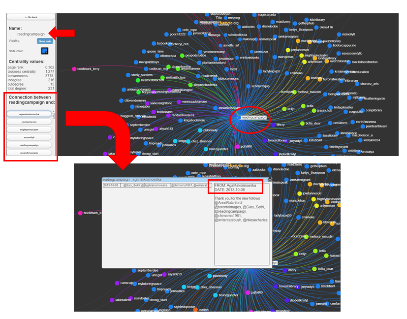
Step 15: Review some of the most connected members in the network, as indicated by the larger node size, and then read some of the messages exchanged among them and other Twitter users to understand the formation of connections in this network.
To access individual tweets, click on the node/person in question and then click on any of the connecting nodes/names listed in the left pane.
Step 16: Using the Notes feature (see below), annotate 3-5 different clusters/areas in the network that are indicated by different colors.
To annotate information about various clusters or individuals in the network visualization, use the yellow “Sticky Notes” feature. To activate this feature, click the yellow box containing a plus sign located in the bottom right hand corner of the network visualization window (see below).
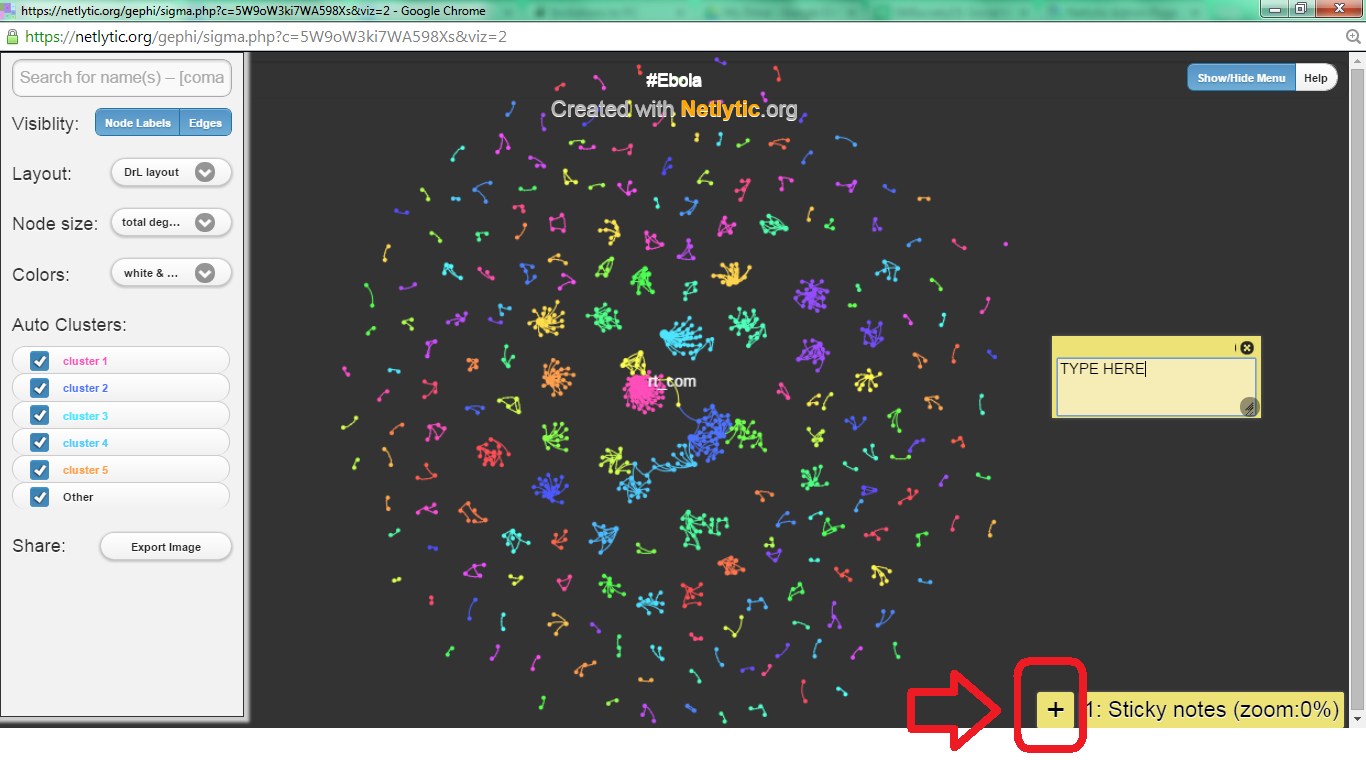
Note: You can add “sticky notes” at the different levels of zoom in the network visualization. To navigate between zoom-levels, you can use “sticky notes” bookmarks that will appear at the bottom lower right hand corner of the network visualization screen along with information about the zoom level associated with each set of notes.(e.g., 0%, 25%, 50%, etc.)

Hint: To capture a snapshot of your network (and any sticky notes about your network), click on the “Export image” button in the left pane. You can only save and publicly share up to three snapshots at a time in the system. If you want to take and save additional snapshots of your network, you will need to save them to your computer first and delete them from the system to make room for new snapshots. For example, you might want to take additional snapshots because you want to show/document something interesting about the interactions of a particular clusters of users in the network.